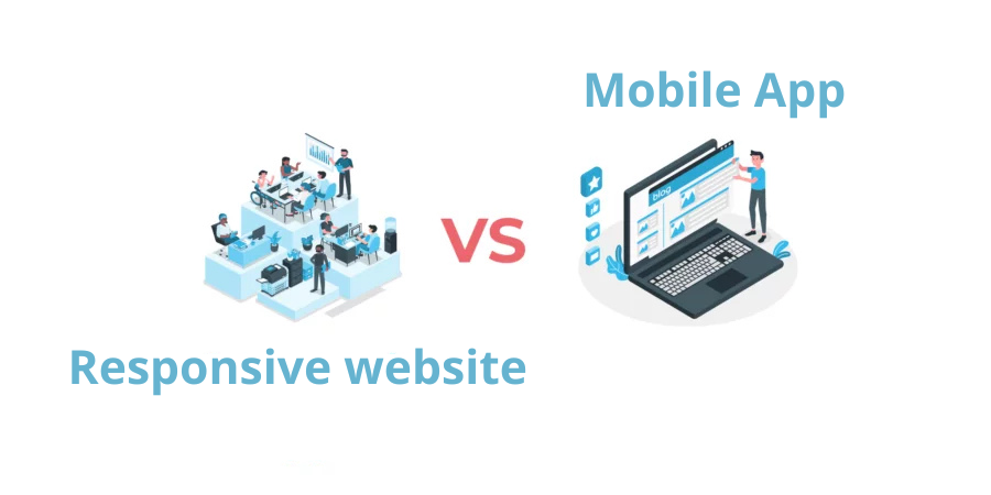
Should you choose a mobile app or a responsive website for your service?
Do you want to launch a service, but you’re not sure which platform to prioritize between a mobile application and a responsive website? We will try to answer that in this article. ✈️
Mobile has been the star format for years among internet users (chat apps, social networks, video games, online searches…).
On the web, for example, according to an analysis by Statista, mobile devices generated 54.8% of global web traffic in early 2021.
Regarding mobile apps, compared to 2017 for example, the download rate increased by 45% in 2021.
Pandemic-related restrictions favored this growth (lockdowns, limited outings…), and mobile purchasing became the first reflex: delivery of online purchases, meals, and groceries.
Despite this mobile popularity, desktop use should not be overlooked: desktop accounts for 43% of global web traffic (particularly during the day).
Websites and mobile applications each have their own context of use. In reality, the choice between the two depends on the nature of your service and when users prefer to access it.
Mobile application and responsive website: characteristics and features
The major advantage of a responsive website is its accessibility on mobile, tablet, and desktop. During a Google search, via a mention on social media, or when being shared, a responsive website is accessible in one click on all browsers.
The features of responsive websites evolved with the appearance of PWAs (Progressive Web Apps), announced by Google in 2016. These combine the advantages of a mobile application while being websites.
A progressive web app is a responsive website that offers more flexibility. You have, among other things, the possibility to create a shortcut on the mobile home screen and send push notifications (even if iOS poses challenges with its Safari browser). It is not only updated automatically without user action, but it also takes up less storage space.
PWA development is done with the same languages as a responsive website, namely: HTML5, CSS3, Javascript, PHP… They can also be developed via a CMS: WordPress, Joomla, PrestaShop…
With the arrival of PWAs, the line between mobile applications and websites is becoming increasingly thin. However, there are still some differences that we have summarized in this table:
| Features | Mobile App (iOS/Android) | Responsive Website on iOS | Responsive Website on Android |
| Offline availability | ✔️ | ✔️ | ✔️ |
| Push Notifications | ✔️ | ❌ | ✔️ |
| Installation | ✔️ | ✔️ (but not intuitive) | ✔️ |
| Interactivity with device features | ✔️ | ✔️ | ✔️ |
| Automatic updates | ❌ | ✔️ | ✔️ |
| Fast page loading | ✔️ (as they are stored on mobile) | ❌ | ❌ |

What is the benefit of developing a website for your service?
Even though the massive success of mobile applications seems to overshadow mobile websites, the latter are far from ineffective in a global strategy.
Responsive websites have the advantage of being present everywhere: on mobile, tablet, and desktop. They thus target a wider audience and represent an important source of traffic.
If your site is an e-commerce platform, for example, your customers will tend to take their smartphones and search for a product on Google. If your site is well-indexed, customers will find you on the 1st page. Thus, they can consult your site and potentially place an order.
It should be noted that while quick searches are easier on mobile, in-depth research (documentation, comparing e-commerce products, news…) is performed on a larger screen: the desktop.
According to Broadband Search, the e-commerce conversion rate is 4.81% for desktop compared to 2.25% for mobile.
The primary advantage of using desktop is the ease of web navigation; for example, opening a browser on a computer allows for easy switching between different tabs. Also, many in-depth searches are conducted for work. Most traffic recorded on websites arrives during the 8 a.m. to 6 p.m. time slot.

Source: Neilpatel
This observation is applicable for all types of websites: searching for information and discovering services is simpler on a large screen.
The website can allow you to gain many customers through Google. On the other hand, to build customer loyalty, the mobile application is the primary channel.
The mobile application: a must-have or a luxury?
The hype around mobile applications suggests it’s the first choice to make. In reality, it all depends on your industry and the service offered.
If we take the example of a dating or online chat service such as a social network, it is natural to opt for a mobile app. Users will visit often and will therefore prefer a mobile app available in one click.
We can also mention the example of games and educational platforms where all intuitiveness is based on the mobile application.
This graph from Statista indicates a 62% increase in the growth rate for educational mobile apps between 2017 and 2021, particularly those facilitating remote education since the appearance of COVID-19.
Right after, we find professional mobile applications with a 57% increase following the adoption of remote work.

One reason for this growth is the user experience offered by applications. The average loading time for an app is estimated at 8 seconds, compared to 22 seconds for a mobile website.
This speed is due to the storage of the application’s screens in the device’s memory from its initial download. In the case of a website, however, pages must be loaded each time from remote servers.
The hardest part in the case of a mobile application is precisely convincing users to download it, but also to consult it often. This is why we say it comes into play after customer acquisition and in cases where the customer is loyal to your service.
Mobile application and responsive website: two travel companions
Finally, wanting to exclusively choose a mobile application or a responsive website is not necessarily relevant; the two channels complement each other and each contributes in turn to the customer journey. We can mention 3 scenarios:
1 – Primarily Responsive Website (e-commerce)
In the case of e-commerce sites such as ASOS for example, the responsive website plays its biggest role in customer acquisition. It targets customers and attracts traffic. According to Similar Web, 45% of ASOS web traffic comes from a product search on Google.
Once the customer base is obtained, the mobile application comes in to build user loyalty and offer them an optimal mobile experience. (Back in 2017, 58% of ASOS purchases came from the mobile app).
2 – Primarily Mobile Application
In the case of services requiring geolocation, GPS, and intuitiveness: the mobile application is the main platform, but this does not eliminate the need for a website.
To order an Uber driver nearby or find a “date” for the evening on Tinder, it’s clear that the mobile application is the first reflex. The very principle of Tinder is the finger swipe.
For this type of services, the responsive website, known as a corporate site, will add weight to the brand: official representation, credibility, and more information for users.
If we take the example of the Uber website, it presents the features of all Uber mobile apps: customers, drivers, couriers, restaurants, business… Also, the site contains pages presenting the company and its ways of working, which guarantees transparency and proximity with visitors.
The goal of a corporate website is not to bring in traffic or make sales. Instead, it aims to present the company to the general public: customers, investors, competitors, organizations. It helps highlight the brand’s added value.
3 – Mobile application and responsive website used according to context
In the case of a service such as those offered by Doctolib, Ubereats, Seloger, or Leboncoin for example, the website and the mobile application complement each other to ensure the evolution of the service.
Indeed, each of the two platforms is used according to context and timing:
- A user on the go will prefer using the mobile application available in one click (if it’s already installed).
- A user at the office will instead go to the website on desktop. Since the computer is their work tool, they will prefer to stay on the same screen.
We can also add that for many B2B services, the desktop website is often the first to launch.
At Aventique, and after establishing a well-detailed requirements document, we put our expertise at your disposal to develop the mobile application and/or responsive website reflecting your product’s image.
You might be asking these questions
Is a mobile app a necessity for a business?
The choice of whether or not to develop a mobile application with a mobile development agency depends largely on your industry and the services/goods you offer.
Is a mobile app a necessity for a business?
When the goal is to attract maximum traffic, it is preferable to opt for a responsive website.